Dancing Gnome Beer Branding & Packaging
Dancing Gnome was in need of a new and refined look. Having established their initial brand look back in 2014, it’s gone through multiple iterations and versions. Branding took a back seat to running the business and crafting beers they can’t make fast enough to keep up with demand.
After conversations with the team, we collectively determined the brand was in need of a refresh and update in favor of a full-blown overhaul. The brewery has a bit of cult following, and has come to mean many different things to a lot of different people even outside the immediate circle of owners & employees. It was important to respect that, and make sure we didn’t loose any brand equity along the way.


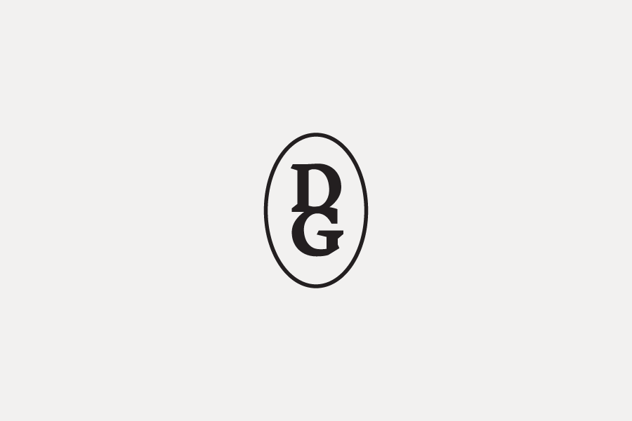
Previous Logo

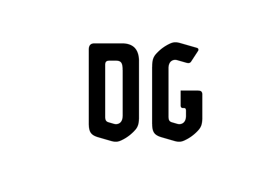
Updated Logo


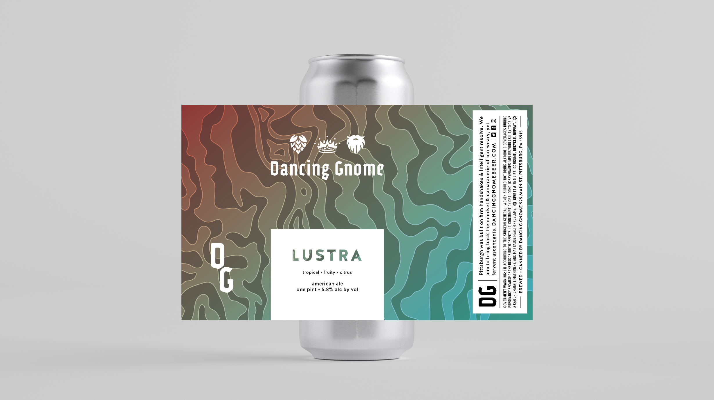
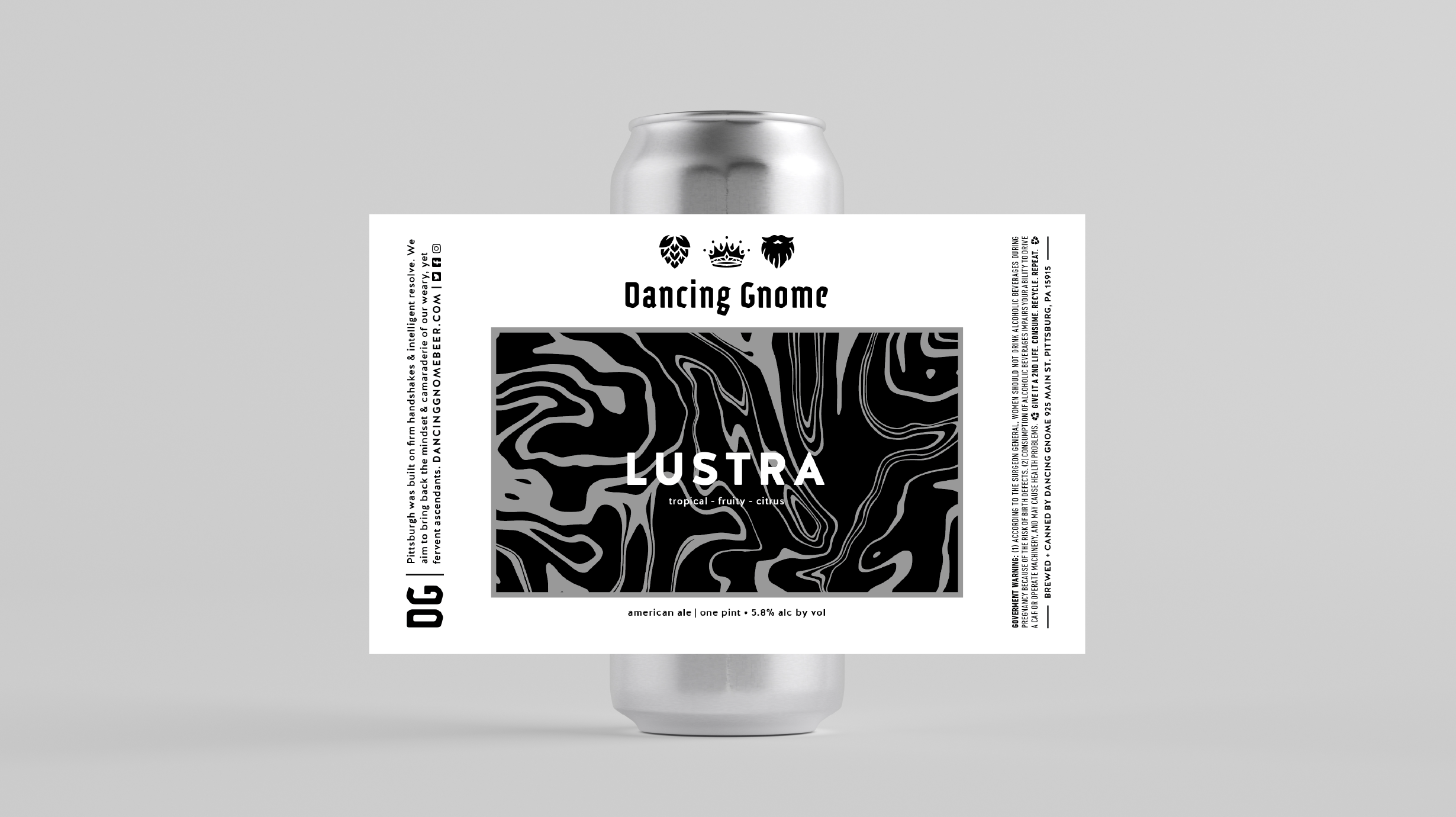
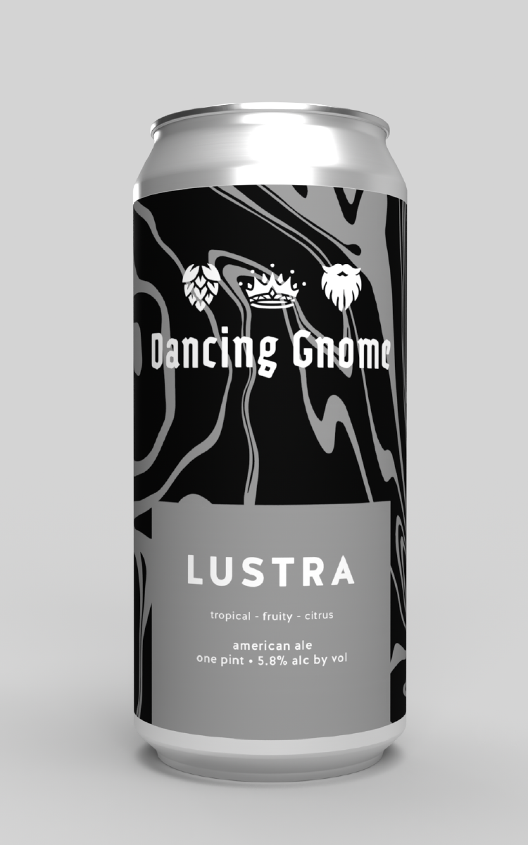
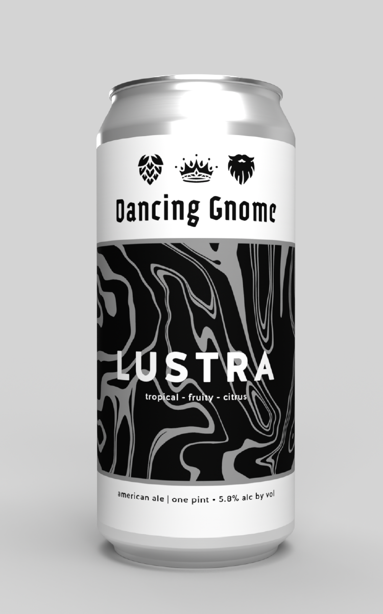
Within the first round of options presented, the DG team gravitated toward a new direction with the wordmark. Eliminating the flourishes and serifs from their existing mark, we landed on a simplified and modern blackletter type.


With such a proud and loyal following surrounding the DG brand, it took a few more than one round to finalize the look and feel of the new “trifecta” (hop, crown, and beard iconography). After many iterations we landed on a final version that fit the wordmark and felt like an appropriate evolution of the previous.


The Dancing Gnome team was extremely fun to work with, despite the project occurring during a time of great uncertainty throughout the world. We can’t wait to see this new branding out in the wild & hopefully it is enjoyed as much as their patrons enjoy drinking their brews!